About OneTick Checkboxes
The OneTick Checkboxes is a central hub where you can create and manage all the checkboxes. In this article, we will guide you:
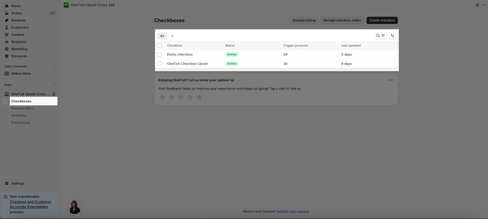
Access OneTick Checkboxes
On the OneTick Dashboard, choose the Checkboxes section.
Create Checkboxes
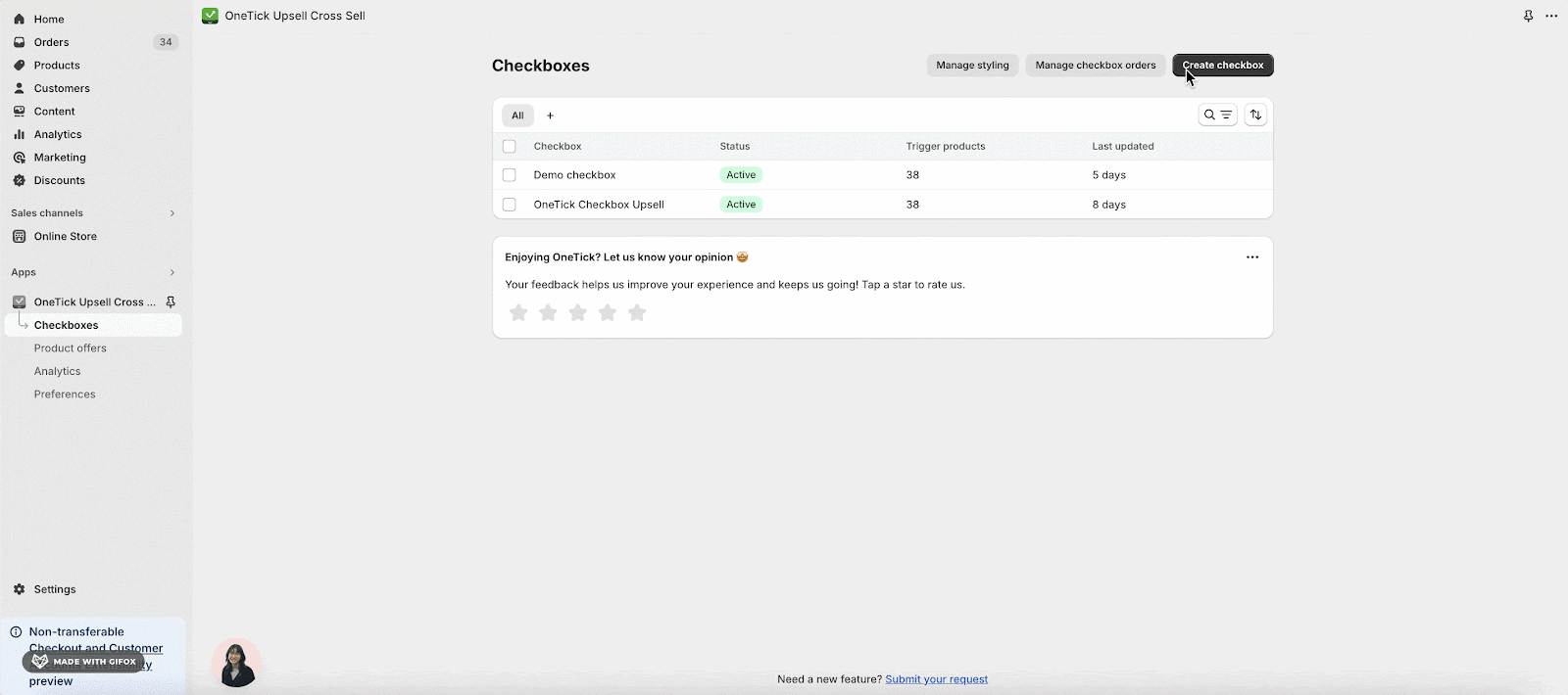
You can create a new checkbox by clicking on the Create checkbox on the top right.
For further details, please check out the “How to create checkbox” article.
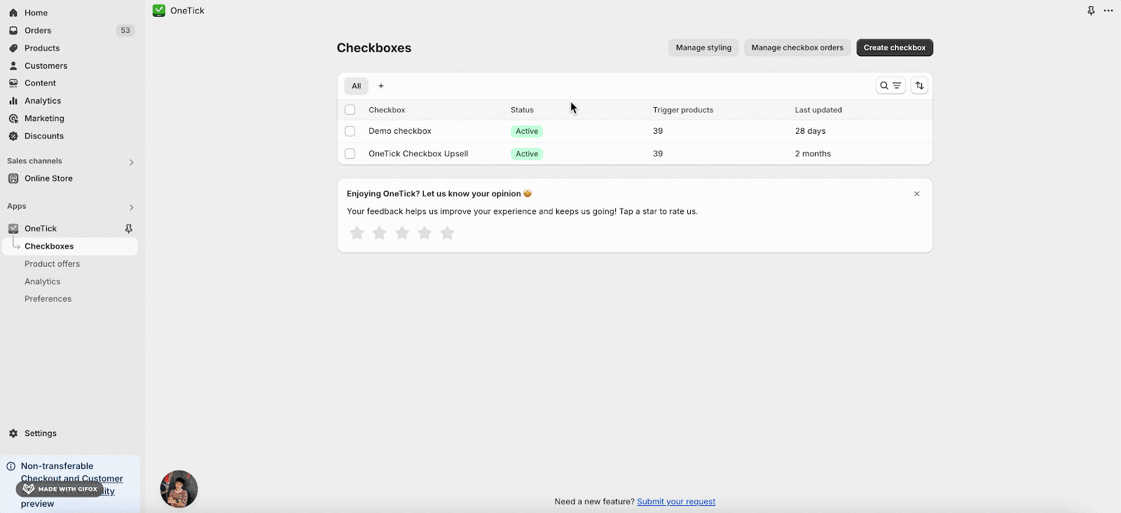
List of Checkboxes
You can see a detailed list of all your existing checkboxes. This list typically displays:
- Name: Easily identify each checkbox by its assigned name.
- Status: Stay informed about the current status of your checkboxes.
- Trigger products: Quickly see how many products each checkbox is associated with.
- Last updated: Display last edited time.

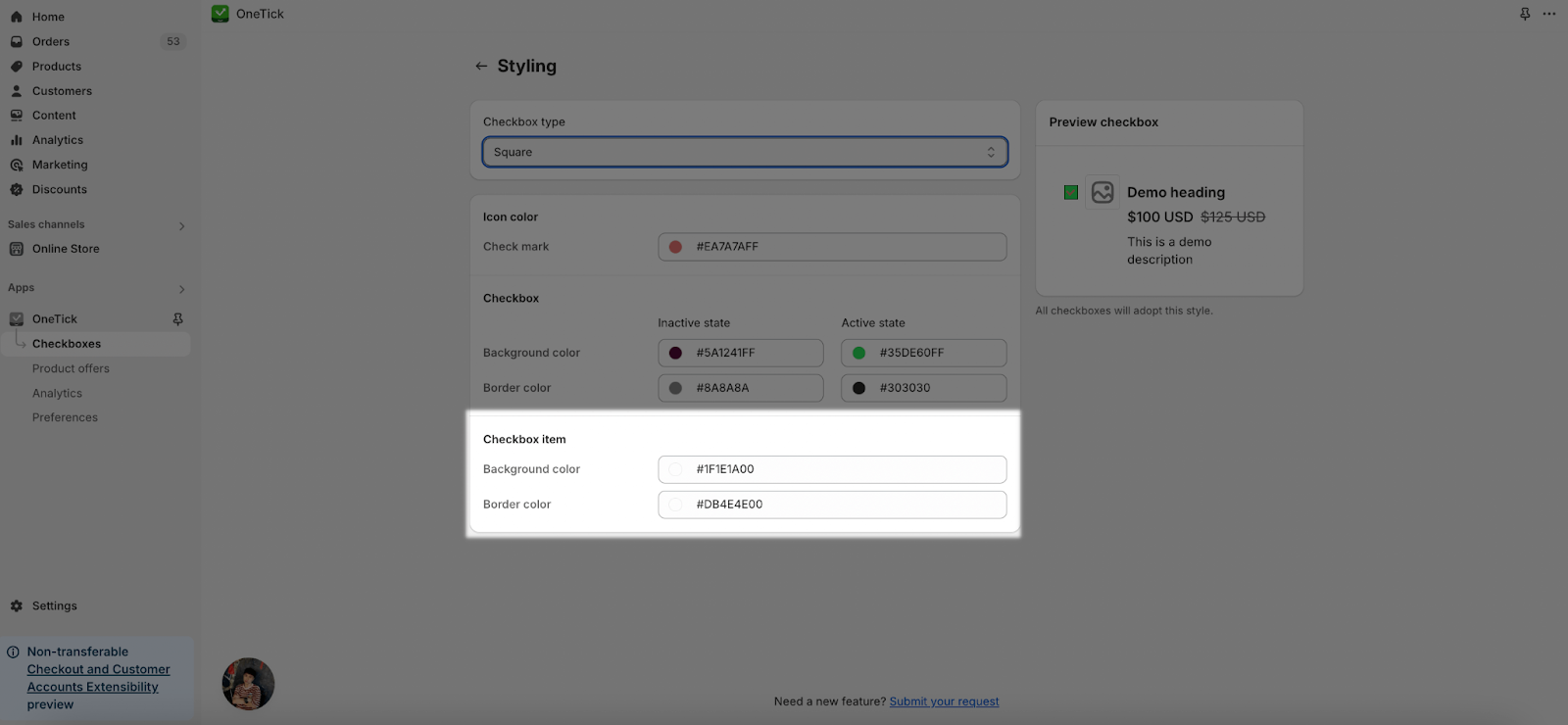
Customize Styling
From the Checkboxes section, you can manage styling of all checkboxes created by changing the checkbox type, color for icon, checkbox and checkbox items. This will help you to customize all checkboxes created.
On the Checkboxes page, choose Manage Styling for the checkboxes.
Checkbox Type
You can personalize the look of the checkbox by choosing between three different styles:
- Square
- Round
- Rounded corner
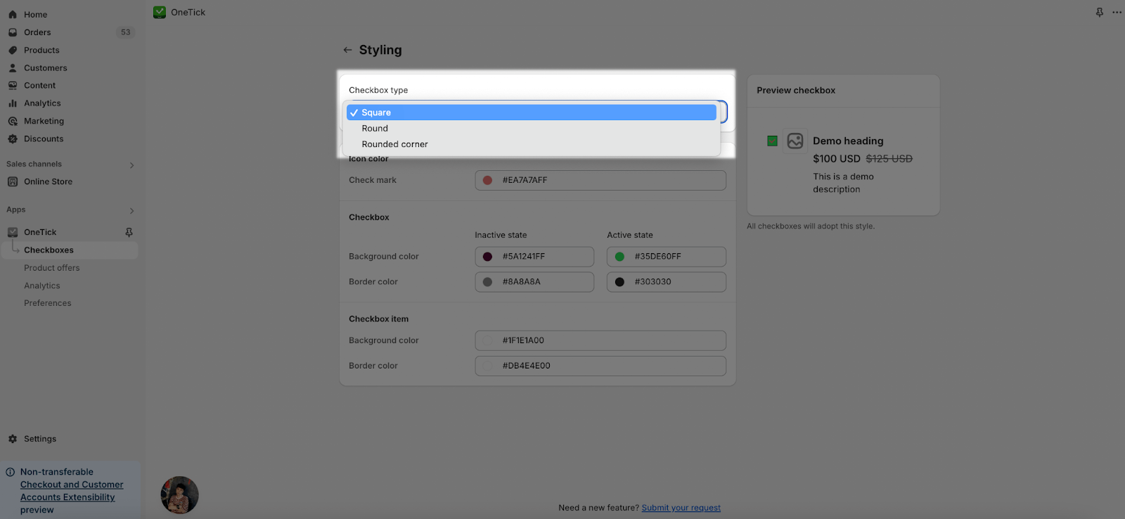
Besides, you can take a look at the Preview Checkbox on the right side for any changes you choose.
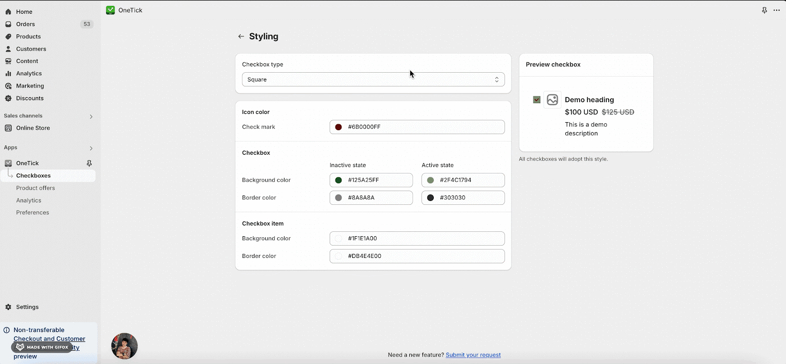
Checkbox Color
You can also change the color of the checkbox:
- Icon Color – Check mark: The color of the tick mark in the checkbox
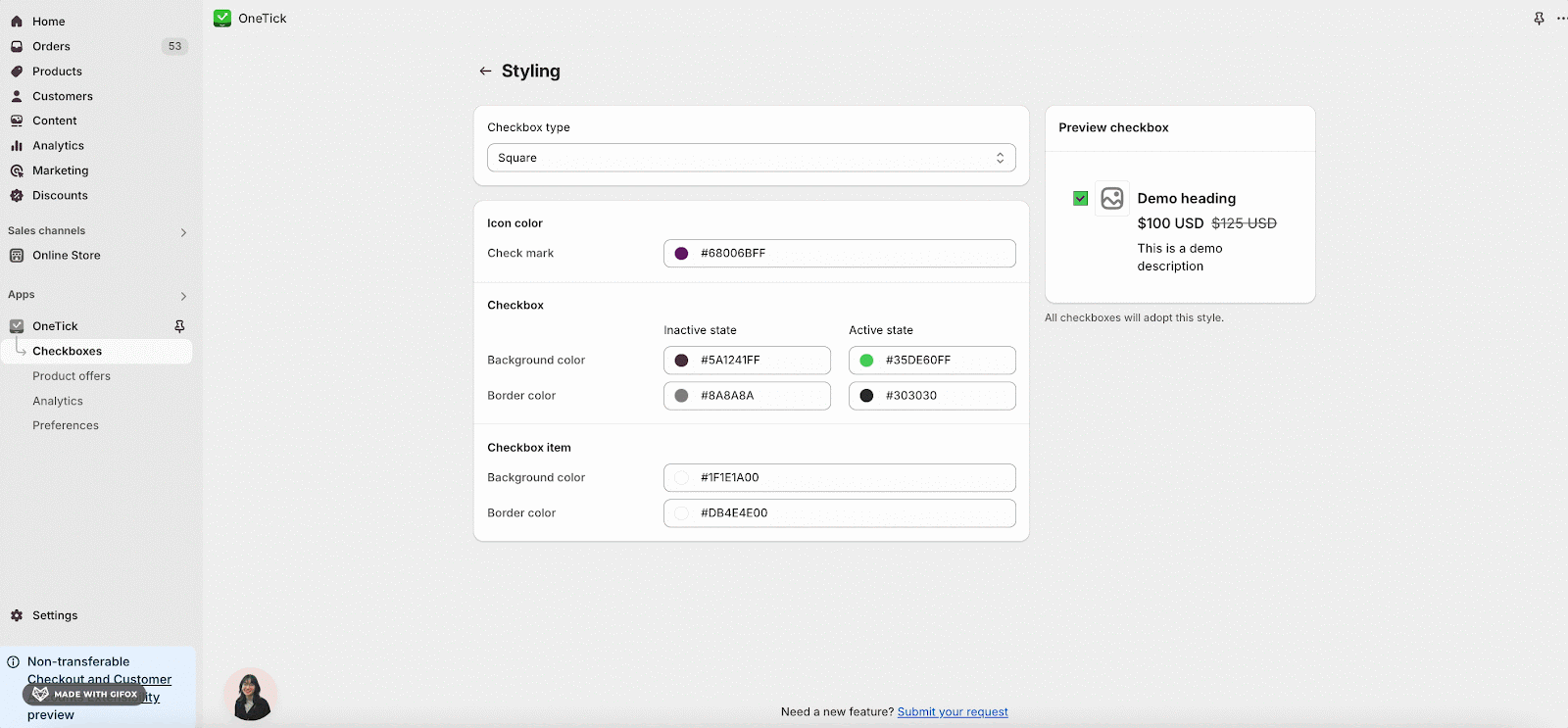
- Checkbox color:
- Background color.
- Border color.
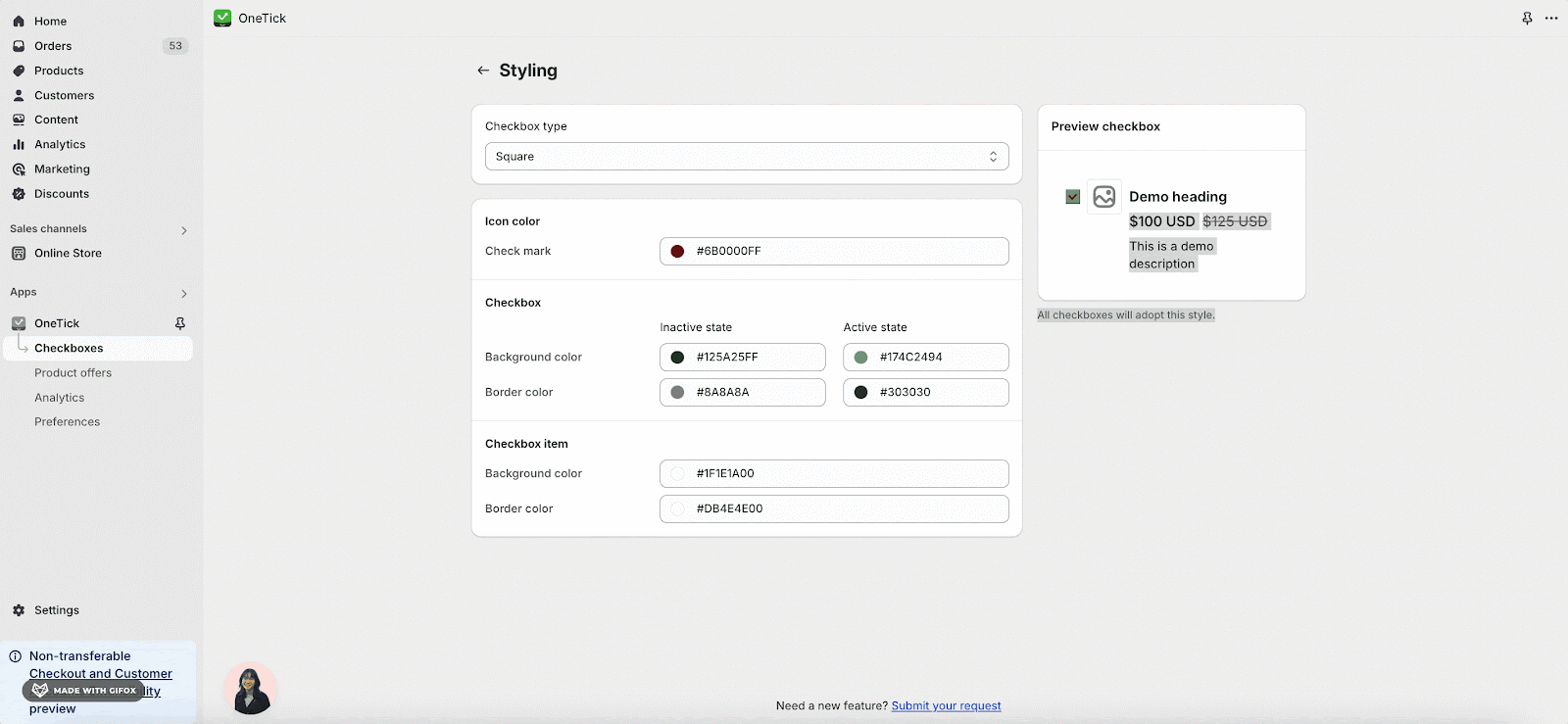
- Checkbox item:
- Background color.
- Border color.
Frequently Asked Questions
1. Can I edit an existing Checkbox on OneTick?
Yes, you can typically edit most aspects of an existing checkbox, such as its trigger products, add-on product, heading, description, image, type, and color.
2. Can I change the font style of the checkbox heading and paragraph?
Yes, you can modify the font style for the checkbox heading and paragraph. The font family and color will match the overall theme of your website. By default, headings are set to 16px and descriptions to 14px. For further customization, such as adjusting the font size, you can use custom code within the theme editor.
3. How can I apply a different style to specific checkboxes?
While the standard practice is to maintain a consistent style across all checkboxes for uniformity, you can assign a distinct style to particular checkboxes. This is done by incorporating custom code into the theme editor, specifically within the custom CSS section of the app block. Should you require assistance, our chat support system is ready to help.