In the Instagram pop-ups settings, you can configure the pop-ups that appear when clicking on a post in the Instagram feed.
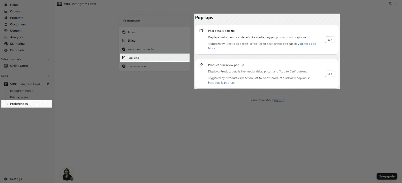
There are two elements that you can customize:
- Post details
- Product quickview
To customize each element, click on the “Edit” button located to the right of the respective element’s name.
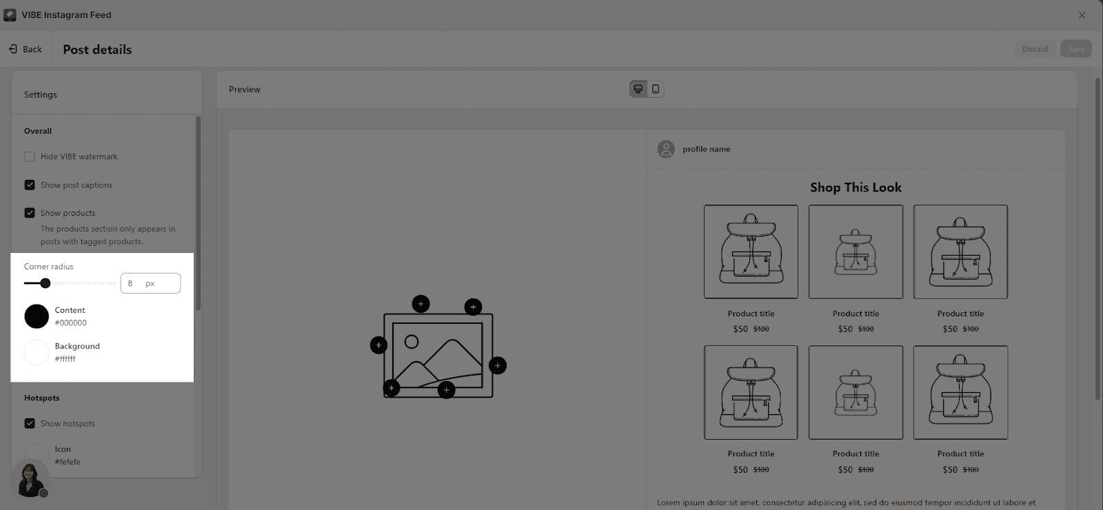
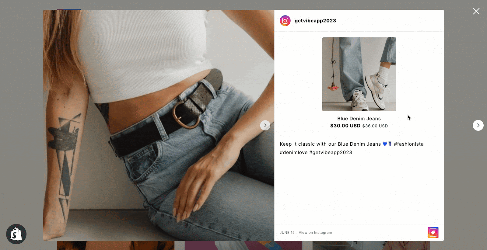
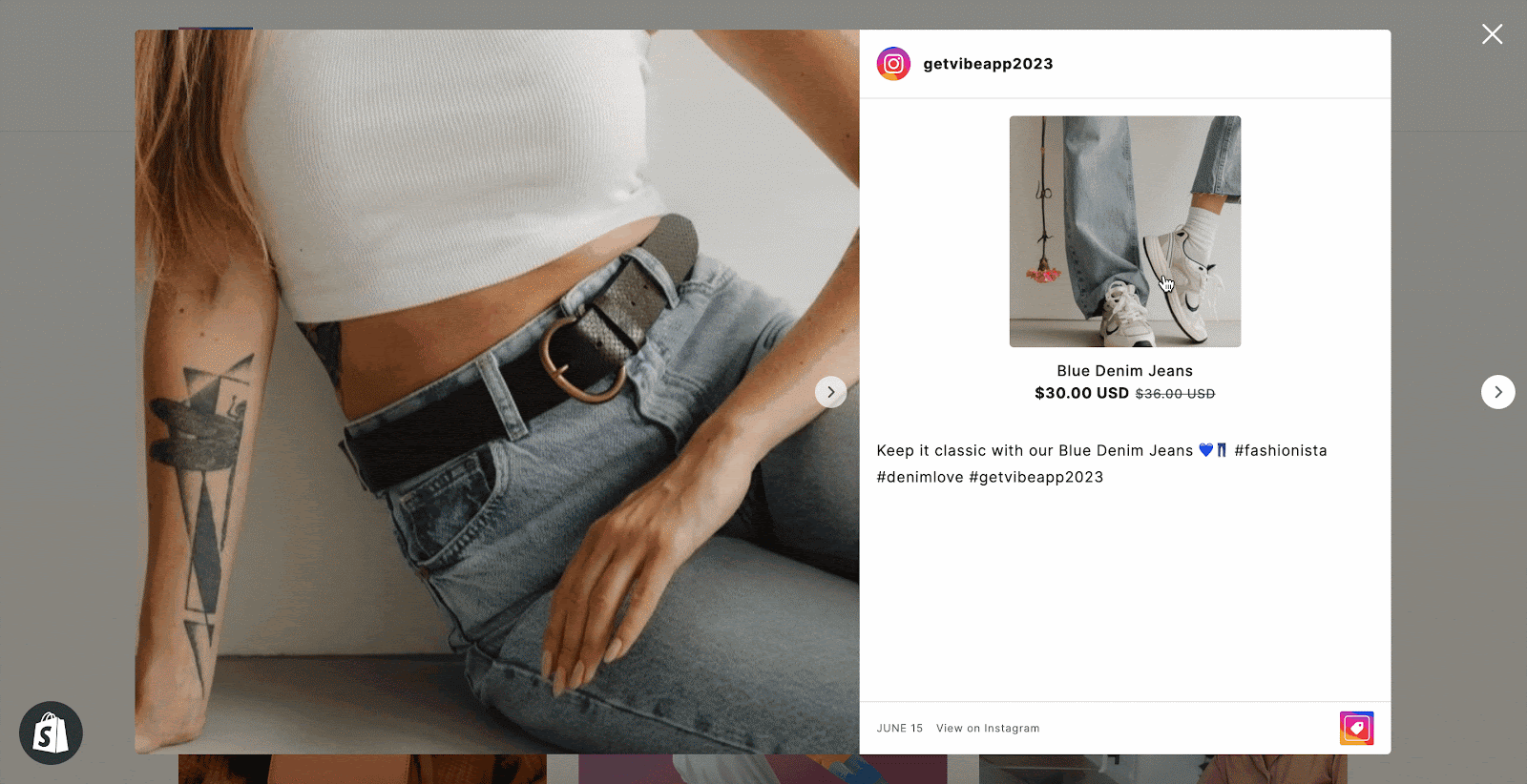
Post Details Pop-Up
In the Post Details settings, you can customize the information displayed in the pop-up, which appears when you hover over Instagram feed media or click on a product list and caption.
You can choose to show or hide:
| VIBE logo watermark | This watermark appears at the bottom right of the pop-up and can only be hidden if you are on a VIBE paid plan. |
| Post captions | The caption of the feed that shows on the popup. |
| Products | The products section only appears in posts with tagged products. |
If you choose to show products, there are more options for you to select:
- Hotspots
- Product List
You can also change the Corner radius for the Product image on the list if you choose to show products.
In Post details Pop-up, you can choose the Content color and Background color for the feed.
Hotspots
When hovering the hotspot, the product information will show up. Click on the hotspots to open the Product quickviews or product page according to your settings.

You can set up the background color and icon for the hotspots you have added in the Instagram feed here.

Product List
The Product list will show right above your post content.

You can add a heading above the product list to briefly introduce this product list. Click on the Heading placeholder to add your own heading.
You can choose to show this product list as:
- Grid
- Slideshow
When hovering on each product details, the corresponding hotspots will be highlighted.
If you click on the product details, the Product quickview (if you select to show product quick view after click) for that product will show up .
In the Product click action, you can choose the action after clicking on products information of the product list or the hotspots. You can select from these 2 options:
- Go to product details page
- Show product quickview
You also have the option to:
- Fit image: make the product image scale up to fit the container
- Show product price: show the price of each product
- Show button: show Add to cart button for all products on the list
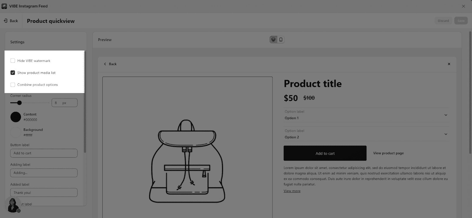
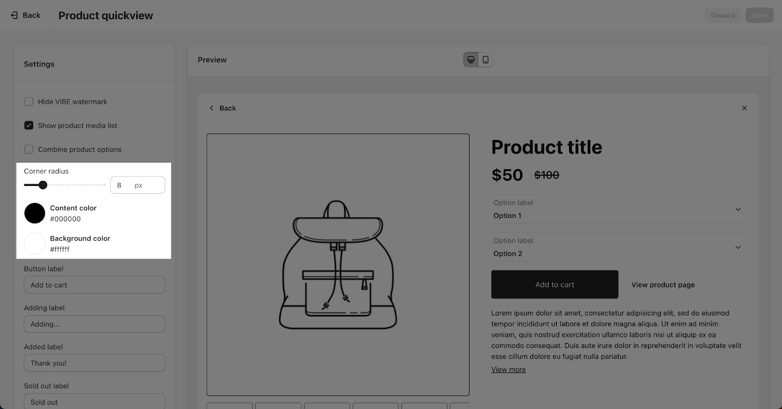
Product Quickviews Pop-Up
To activate the Product Quickview function, ensure that your Post Details include a Product click action that’s configured to ‘Show Product Quickview’.
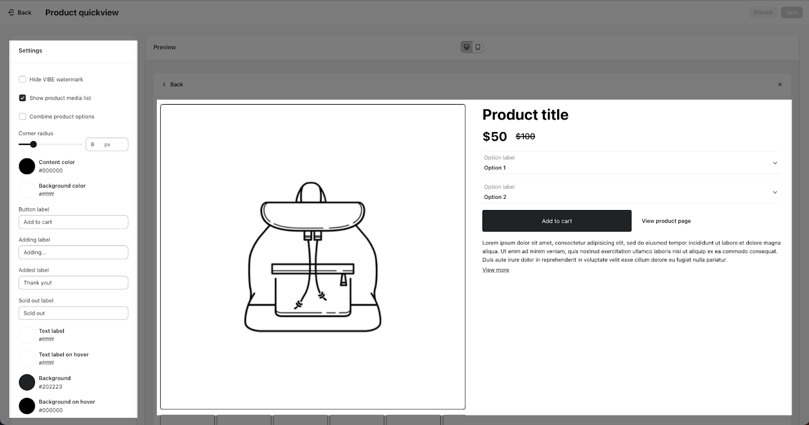
In the Product quickview settings, you can select to show or hide:
| VIBE logo watermark | Only available when you are on a VIBE paid plan |
| Show product media list | Default show as partial item slideshow |
| Combine Product option | Allow combining product options for simplified purchasing |

The Corner Radius option is for setting the radius of the product image. You can drag the bar or insert a number from 0px to 20px for this option.
You can change the color for the Quickview popup:
- Content color: color of all text on the popup
- Background color: color of the background
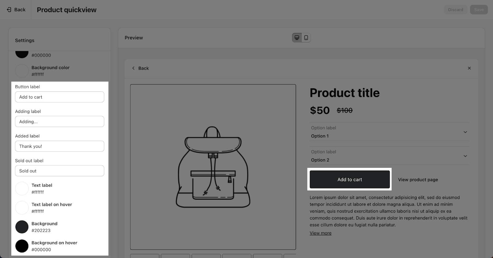
You can also change the text for the Add to cart button in:
- Button text
- Adding text
- Added text
- Sold out text
Along with that, there are options for setting the Text label color, Text label on hover, Background and Background on hover.